
The calendar
The calendar shows the month the way the math sees it: every bill on its projected date, every paycheck on its schedule, and the day your cash dips lowest before payday.
Where to find it
Section titled “Where to find it”- iPhone: More → Calendar.
- Web: Calendar in the sidebar, under Your week.
Reading the grid
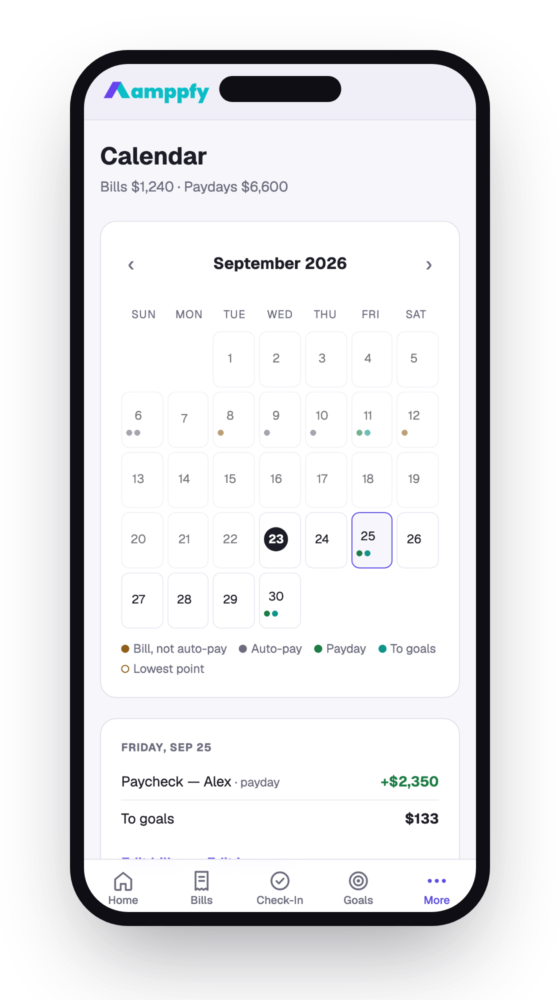
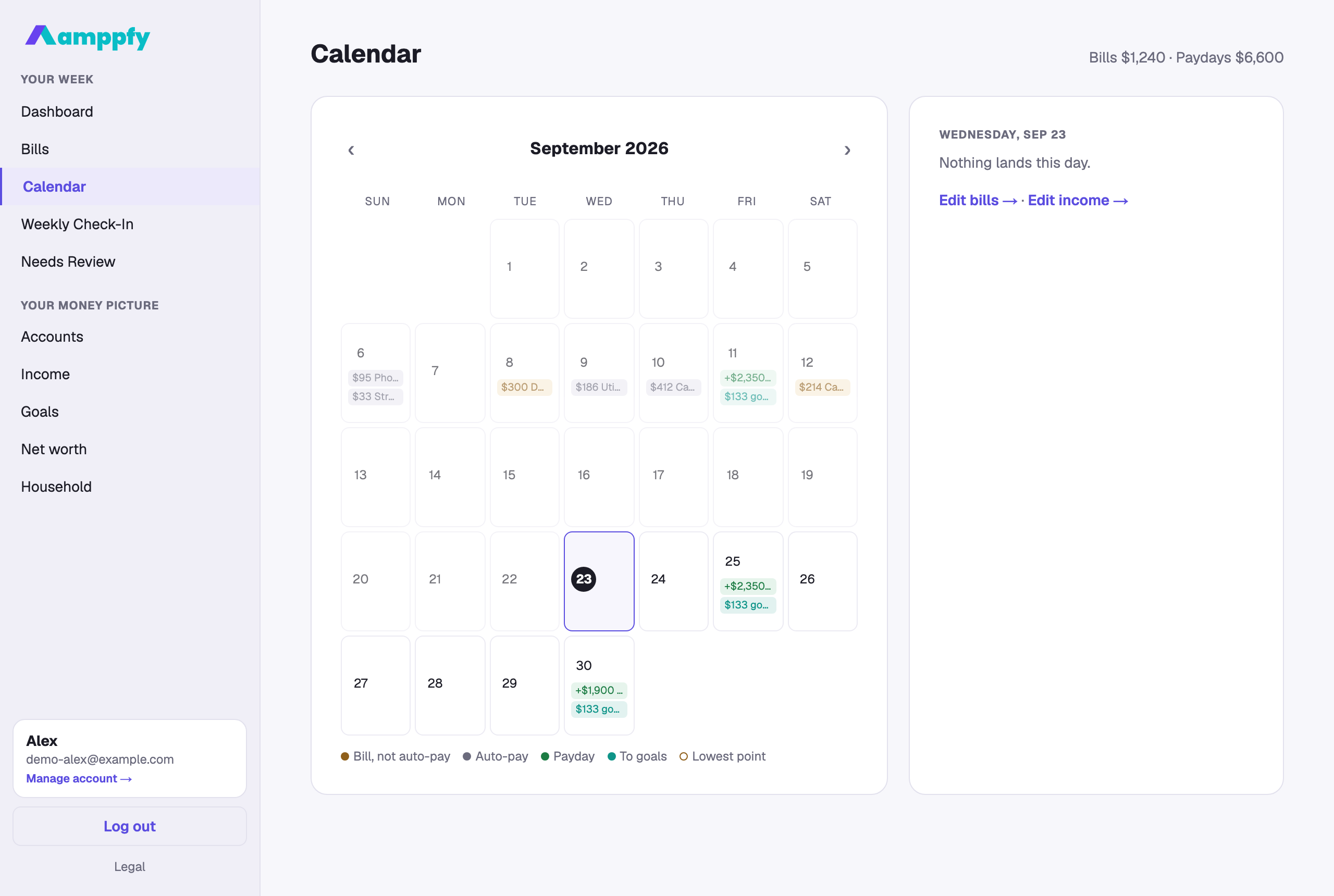
Section titled “Reading the grid”Above the grid, a summary line adds up the month: “Bills $2,890 · Paydays $4,700 · Lowest point Oct 8”. Today is outlined; days already past are dimmed.
On iPhone each day carries small dots; on the web the events sit inside the cells as chips. The legend under the grid explains the colors:
| Dot | Meaning |
|---|---|
| Amber | A bill that isn’t on auto-pay — the ones worth a glance |
| Grey | A bill on auto-pay |
| Green | A payday |
| Teal | To goals — the share of your goals’ monthly amounts that this payday covers, the same amount the payday nudge proposes |
| Amber outline | The lowest point — the day your cash dips lowest before payday, after the bills that land on it |
Bills appear on the dates Amppfy projects from their anchors, so a monthly bill shows up on the same day each month without anyone updating it. See Bills roll forward on their own.
Tap a day
Section titled “Tap a day”Tap any day and a panel below the grid lists what lands on it — each bill with its amount and whether it’s on auto-pay, each paycheck, and the amount to goals. On the lowest-point day, the panel also states the dip in plain numbers: “Lowest point before payday: $312 after rent.”
Changing something
Section titled “Changing something”The calendar is a view, not a place to edit. Under the day panel, Edit bills → and Edit income → take you to the screens where amounts and dates live; the calendar updates the moment you save.